Analyzing Color Palettes in Classic Spaghetti Western Films
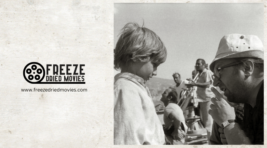
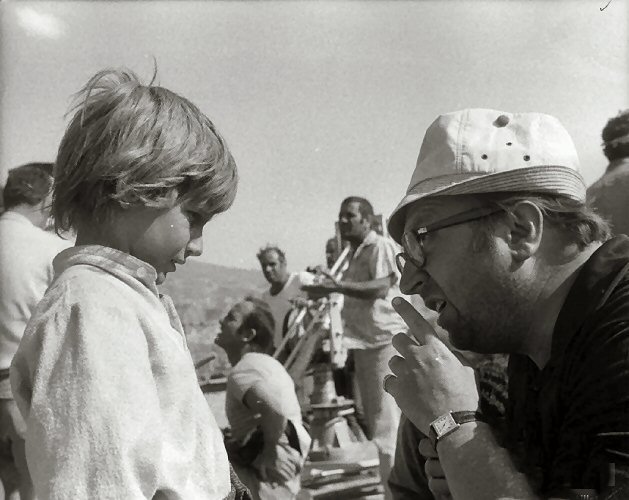
You've likely noticed how Sergio Leone's westerns burn with unmistakable ochre and amber tones that seem almost tactile in their intensity. These aren't just aesthetic choices—they're visual storytelling tools that communicate everything from moral ambiguity to psychological states. The scorching desert palette doesn't just establish setting; it creates an emotional landscape where characters exist in perpetual visual tension.
Beyond Leone's masterworks lies a fascinating evolution of color technique that reveals how different directors approached the same cinematic language with distinct visual accents.
The Signature Warm Hues of Leone's Desert Landscapes
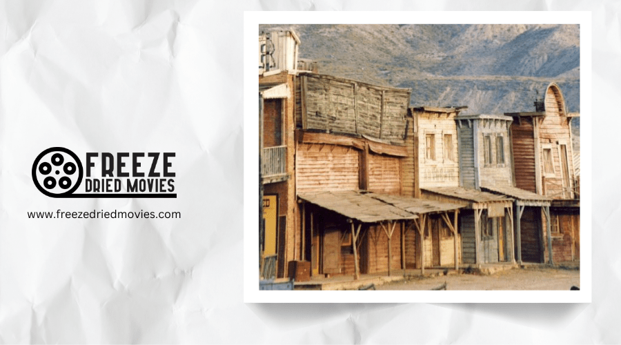
When you examine Sergio Leone's spaghetti westerns, the saturated warm color palette immediately commands attention. His masterpieces like "The Good, the Bad and the Ugly" drench every frame in rich earthy tones—reds, oranges, and yellows dominate the sun-scorched landscapes of the American Southwest.
Leone's genius lies in how he contrasts these warm exteriors with cooler interior shots, creating dramatic tension through color alone. The film grain combines with his meticulous color grading to produce that distinctive sepia-toned, high-contrast look that separates his work from traditional Hollywood westerns.
Through anamorphic lenses, Leone captures vast desert panoramas bathed in amber light, establishing the gritty, operatic visual style that defines the spaghetti western genre to this day. Much like the filmmakers of 1950s Westerns, Leone utilized natural lighting techniques to enhance realism and showcase the stark beauty of desert landscapes.
Color Symbolism and Character Development in Western Narratives
While Leone's landscapes established the atmospheric foundation of spaghetti westerns, it's through deliberate color symbolism that directors crafted nuanced character identities.
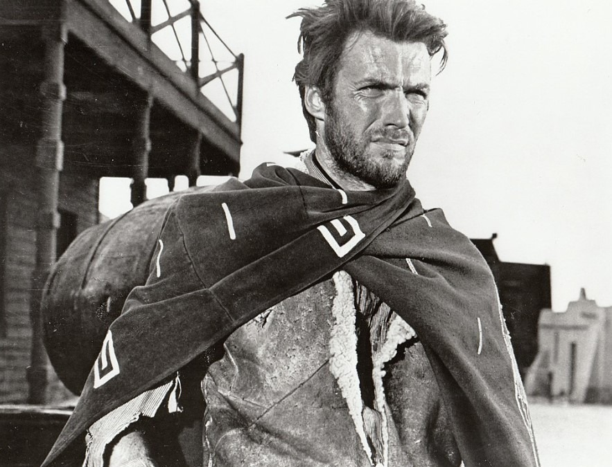
You'll notice this technique perfected in "The Good, the Bad and the Ugly," where Eastwood's "Good" character consistently appears in faded blue and brown tones, suggesting moral ambiguity rather than heroic virtue.
Angel Eyes, "the Bad," wears stark black against pale skin, creating visual tension that signals his dangerous nature before he even acts. Meanwhile, Tuco ("the Ugly") displays a chaotic mix of earthy colors, reflecting his unpredictable allegiances.
This color coding extends beyond costumes to personal environments. When characters evolve, subtle palette shifts signal their transformation, allowing you to subconsciously track moral development through visual cues rather than exposition.
Eastwood mastered this visual language of westerns before bringing his minimalist approach to directing his own films, beginning with Play Misty for Me in 1971.
Technical Approaches to Achieving the Spaghetti Western Look
Recreating the iconic spaghetti western aesthetic requires specific technical tools and approaches that modern filmmakers can adapt. To emulate classic Western films, shoot with anamorphic lenses around 24mm on full-frame or 12mm on micro four-thirds cameras. This captures the distinctive wide-angle compositions that define the genre.
For authentic color grading, apply a Kodak daylight film stock profile and implement secondary color adjustments to achieve that warm, desaturated vintage look. You'll want to reduce green tones while emphasizing reds and oranges in your palette.
Post-processing techniques like matte art correction, vignettes, and corner blur further enhance the spaghetti western visual signature. For best results, consider using DaVinci Resolve, which offers more sophisticated color grading capabilities than Premiere Pro or After Effects. Understanding the impact of Technicolor's legacy on modern film aesthetics can help filmmakers better recreate or reimagine vintage western palettes with contemporary technology.
Comparative Analysis of Color Usage Across Different Directors
How distinctly did the masters of spaghetti westerns approach their color palettes? When you compare Sergio Leone's work to that of Sergio Corbucci, you'll notice stark differences in their directorial color preferences. Leone favored sun-bleached yellows and dusty browns, creating a parched, unforgiving landscape in films like "The Good, the Bad and the Ugly," while maintaining pops of vivid red for moments of violence.
Corbucci, in contrast, employed a darker, more somber palette in "Django," with muddy browns and slate grays dominating his frames. Damiano Damiani's "A Bullet for the General" showcases a rich, saturated approach with golden sunlight and deep shadows. These distinct choices weren't merely aesthetic—they reinforced each director's thematic concerns, from Leone's moral ambiguity to Corbucci's nihilistic vision.
The Evolution of Western Film Aesthetics Through Color Grading
Throughout cinema history, western film aesthetics have undergone a remarkable transformation, with color grading emerging as a defining element of the genre's visual evolution.
The shift from technicolor American westerns to the desaturated, warm-toned spaghetti westerns of the 1960s reflected changing political implications about the American frontier myth.
Sergio Leone's distinctive use of anamorphic lenses created widescreen vistas where color conveyed moral ambiguity rather than black-and-white heroism. The teal-orange balance, increased contrast, and vignetting techniques established a visual language that communicated the harsh realities of the West.
Today's filmmakers can precisely recreate this aesthetic using modern color grading software, allowing contemporary westerns to either honor or subvert the genre's traditional color palette while maintaining visual references to its rich cinematic heritage.
Related posts